There are many (many, many) ways to use SVG assets as icons in UWP / XAML apps, most requiring some form of DataTemplate or UserControl. While these approaches work ok they're normally a pain to author and use, often requiring custom converters to be written if the asset is to be used via any form of data binding. Here I present an extremely flexible way of using these assets that requires nothing more than drag-and-drop.
This approach uses Glyphter - a free, online tool for converting SVG icons to fonts - to produce a custom font containing your SVG assets; similar to fonts like Segoe MDL2 and FontAwesome. Glypter's free tier allows you to craft a single font, containing just basic alpha-numerics. Should you need more than this, you can upgrade to a premium tier which allows you to work on multiple fonts of a much greater size.
Once you've built your font, it can be embedded in the app package and icons displayed by simply using a TextBlock element with the Text property set to the alpha-numeric code of the icon to display and the FontFamily set to the custom font. Furthermore, you're easily able to present the required icons in the desired colour - by changing the TextBlock's Foreground brush - and size - by changing FontSize or embedding within the TextBlock within a ViewBox.
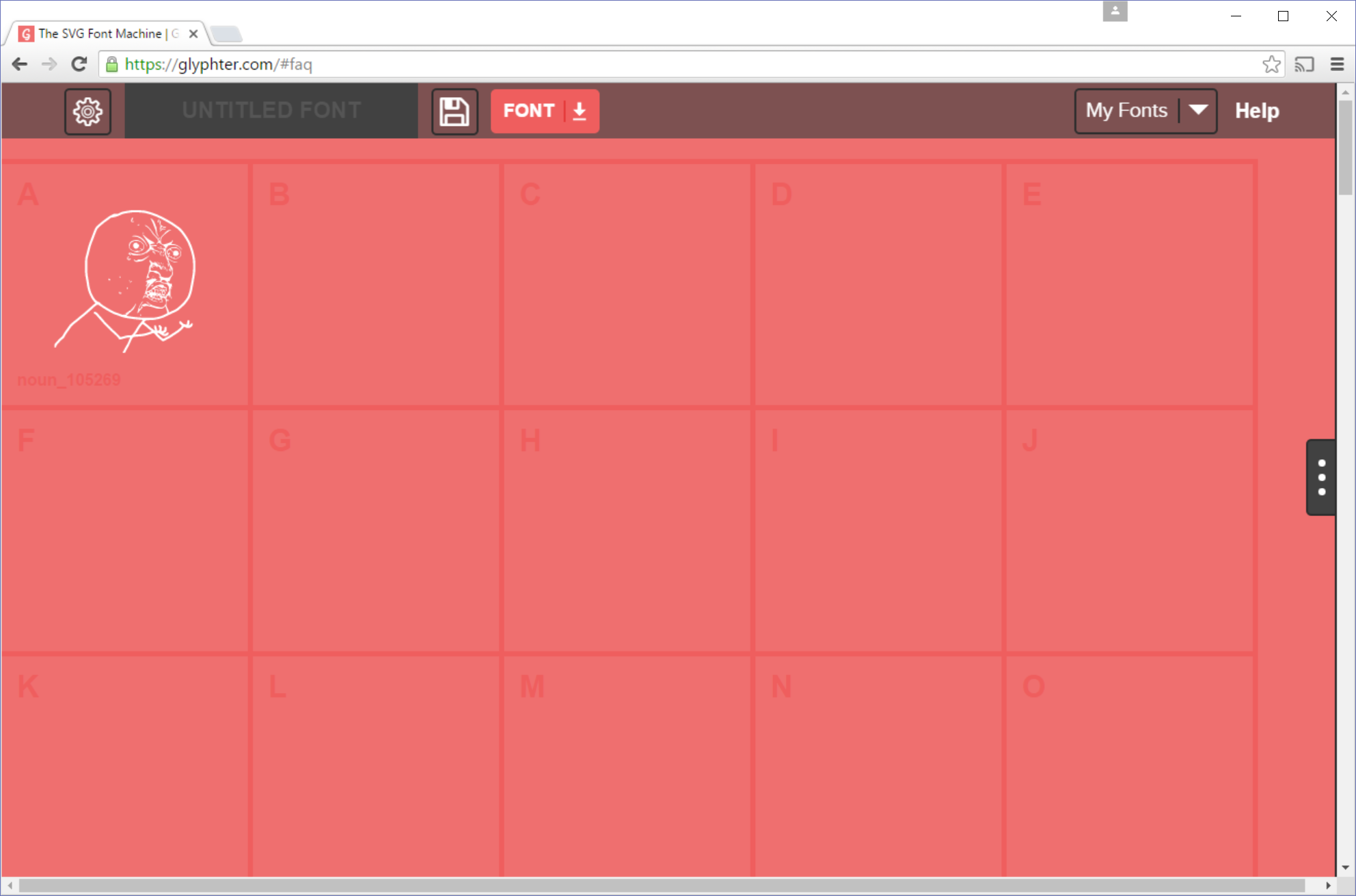
To get started, simply locating the SVG asset you'd like to use. The Noun Project is a good resource containing an incredible number of high quality icons that can be used in commercial products for a small fee or via attribution. Once you've found the icon you want to use - lets use this one by Gareth - simply download the icon as an SVG. Once it's downloaded, locate the file and drag it onto the Glypter grid in the desired location. After a short pause while the file is uploaded to Glypter and processed, it'll appear in the grid slot you selected; here I've added the icon to the 'A':
Repeat this for all the icons you want to use - I'll just stick with the one icon for now - then download the font by clicking the font download button (the 'down arrow' in the 'FONT' button). This will compile all your assets into a zip file containing the font (in '.ttf' and '.woff' formats), svg and css assets. We're only interested in the '.ttf' file so extract it from the zip file and copy it to the 'Assets' folder of your UWP app.
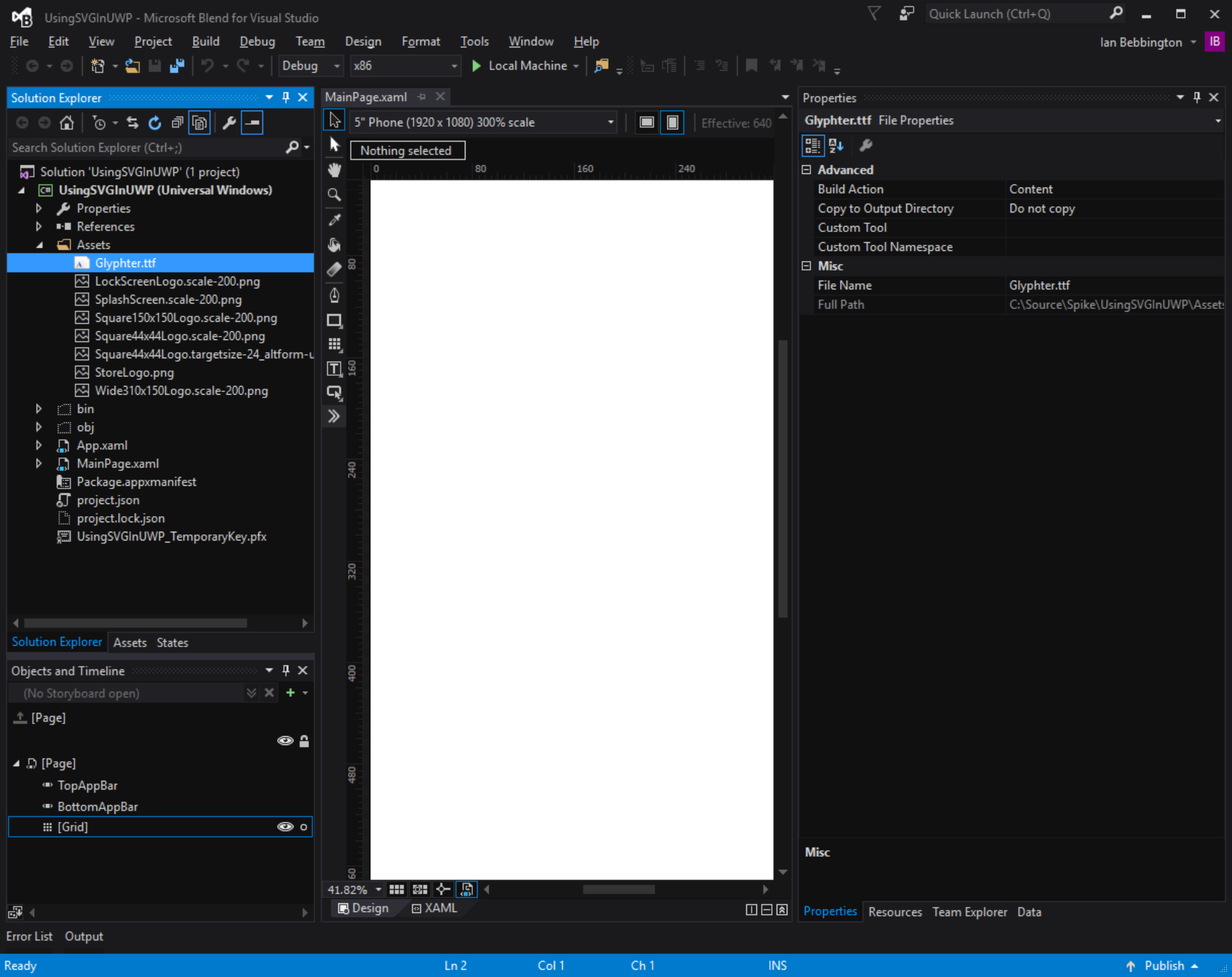
From within VisualStudio - or better yet, Blend - add the '.ttf' file to the project, ensuring it's 'Build Action' is set to 'Content' and 'Copy to Output Directory' set to 'Do not copy' as shown below:
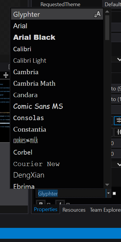
With this in place, when you drop a TextBlock on a page, you should be able to select your embedded font from the Font combobox as shown below:
The rest, as they say, is history. In a few minutes you too can use the following XAML:
<Grid>
    <StackPanel HorizontalAlignment="Center" VerticalAlignment="Center">
        <TextBlock Text="SVG in UWP EZ!" HorizontalAlignment="Center" FontFamily="Impact" Margin="10"/>
        <TextBlock Text="A" FontFamily="ms-appx:/Assets/Glyphter.ttf#Glyphter" FontSize="96" HorizontalAlignment="Center"/>
        <TextBlock Text="Y U NO USE!" HorizontalAlignment="Center" FontFamily="Impact"/>
    </StackPanel>
</Grid>
Note: There seems to be an issue/inconsistency with the FontFamily value created when using the XAML designer to select your custom font. Sometimes, but not always, the designer will fail to add the "ms-appx" protocol to the FontFamily property value which, while it has no effect at design time, will prevent the app from locating the custom font at runtime. You should there ensure this value is present before deploying your app.
To create this amazing UI:

Enjoy.